
What your cycling jersey reveals about you, and the event it advertises
Fashion historian Markas Henry reviews jerseys made to commemorate the Buffalo Bicycle Classic and helps cyclists consider the messages their exercise apparel convey.
By Tim Grassley
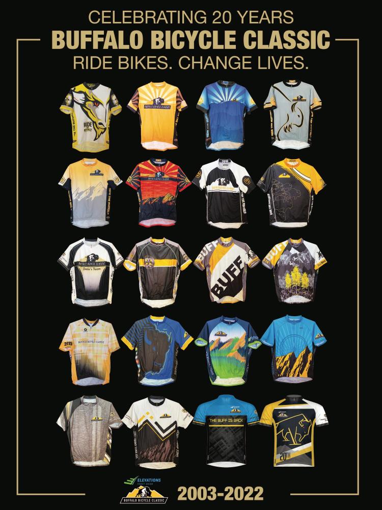
Over its 20-year existence, riders in the Elevations Credit Union Buffalo Bicycle Classic (BBC) have donned a wide assortment of styles to celebrate their day on the road, raising scholarship money for high-achieving undergraduate scholars. But what do these jerseys communicate when one considers their graphics, style and color?
We recently sat down with Markas Henry, associate professor in the University of Colorado Boulder Department of Theatre and Dance to get his read on our apparel. Henry is fashion historian and costume designer whose designs have won multiple Tony Awards, national honors and even caught the eye of pop star Britney Spears.
The following is an excerpt from an interview with the Buffalo Bicycle Classic. To hear the interview in its entirety, including Henry’s take on road cycling vs. mountain biking fashion, visit the BBC’s Podbean page.
We thought of you because of your interest and research in fashion design. Tell us what that normally looks like.
I look at, study and analyze the history of everything in fashion—from ancient Egyptians and before to contemporary (fashion) by looking at trends, style-lines and how people and fashions evolve. It's always about the study of people—what people think and know and what they are attracted to. That affects what they wear and how history records them.
We think of that from a modern point of view with fashion, but we don't often think about it in the 14th century or the 17th century. Fashion is always a reflection of people, their times, what they knew and what they didn't know.
When I think of cycling, I immediately think of the origins of the bicycle: the penny farthing and the Victorian era when people got onto three wheels and pedaled around. What they pedaled around in were suits, ties and bowlers. Women wore hats and skirts. It was kind of ridiculous. Being active was introduced in the Victorian era as people taking in the sun as opposed to staying out of it.
It doesn't look like what we think of as sporting attire today. Attire has changed, become more form-fitting and aerodynamic. It’s Lycra and skin-tight. It zips up and reduces drag. Now, (innovation) is really not about fit and form as it is about graphics and advertising. And what is interesting is to look at what works vs. what is boring and forgettable.
There is a humorously divisive split between mountain bikers and road cyclists, specifically about fashion. Road cyclists wear tight Lycra that’s aerodynamic and form-fitting. Mountain bikers wear thicker fabrics with far more muted colors. What are mountain bikers communicating through their apparel vs. road cyclists, and does it really matter?
Well, it matters to them. But I think the forums are completely different. One is street-based, so standing out and being bold helps with traffic and safety. Visibility is important. Mountain biking comes out of extreme sports and skate punk, and, in mountain biking, there is a different kind of safety. You need apparel that is baggy, breathable and moveable. Stiffer fabrics could be safer if you get caught by a tree branch.
Both fashions start off in the same place and then one goes right, one goes left, and they both make fun of each other and call each other names as they go opposite directions.
If I were talking to my students about starting to figure out character differences—if they were characters in a play and one was a mountain biker and one was a street cyclist—these are the things that start to come into their heads about the choices that they make as they design.
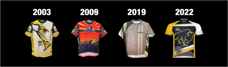
We asked you to come and look at some of the jerseys created for the Elevations Credit Union Buffalo Bicycle Classic. To start, we have the first jersey from 2003. When you saw the kit, how did you read it?
This one was interesting to look at because it's big, bold and graphic. It gets attention with the white base and the bright, bold yellow. It’s almost a zinger lemon yellow. It’s interesting because bold color is used minimally with the exception of the yellow. The graphic is hard-edged and angular. There's almost something menacing about it.
Just a portion of the face is being used—it looks more like a bull to me than a buffalo because so much of the buffalo shape is the full silhouette of the body. When you extrapolate a portion of the skull in the base of a horn, it starts to lose some of the specificity. That would be my artistic criticism. But it's good. I would give it a passing grade.
The next jersey is from 2009. There’s a lot to look at here.
This is bold and interesting. It is arresting and gets noticed. There's a lot going on in this jersey, especially up close. From 50 to 100 feet away, as many people would see this, the little details would get lost. In many ways, that's a good thing because the graphic simplicity of the design really pops as you get close. The design gets more intricate, advanced and sophisticated. I really like this one.
The next one we are going to look at is your least favorite. Tell me about 2019.
Unfortunately, we can’t blame this on the pandemic. It falls out of the scope of everything else that has preceded it. It's not memorable or graphic. It doesn't have the things that the event has used to define its appearance in the past. The buffalo really is diminished. There's a little bit of something happening on the side underneath the arm, but it disappears in the activity (of cycling).
The front and the back of it are the most important things, maybe the sleeves a little bit. Obviously, I have a lot to say, but I wouldn't give this one a passing grade. It’s important to consider what's happening in the world of advertising. Designers find inspiration around them all the time. It's interesting to consider what the inspiration was, but I'm not really that interested in the result.
Our last jersey is from this year’s anniversary ride. Tell us about 2022.
It’s asymmetrical, in the fact that one sleeve is gold and the other sleeve is white. The body of it is black. There's a graphic sensibility that reminds me of the guys and gals in front of a football game or basketball game who are leading cheers. The big graphic over the chest is a little soft but also angular.
This is interesting because there is a lot of movement in the design. This would definitely get a passing grade for me.
Do you have any advice for people that they can consider when trying on cycling apparel or just clothing in general?
In the end, like anything, do what works for you. If you like it and it fits well, then follow the beat of your own drum. What I do in my occupation is I create costumes for an individual so that they don't look like anybody else. In fashion, I jokingly say that one size fits none.
I think that's the interesting thing about fashion. It's about the item and not as much about the individual. I'm not a sports aficionado or a salesman who can advise people what to buy. But I think it is all about finding things that appeal to us as we walk through a store and get pulled into the hanger appeal of something. We get pulled into a color or a graphic shape. The fact that it's a bright blue that stands out in a sea of black on a display. We respond to what catches our eye, and, whether it's fashion or a house or flowers, we seek pretty things.
The Elevations Credit Union Buffalo Bicycle Classic is Sept. 11, 2022. To see all 20 jerseys designed throughout the BBC’s history, check out the commemorative poster in the BBC’s merchandise store.
Remember—every rider registration directly funds student scholarships for high-achieving undergraduate scholars at the University of Colorado Boulder.