
AQIQ Lesson 4
Using Excel
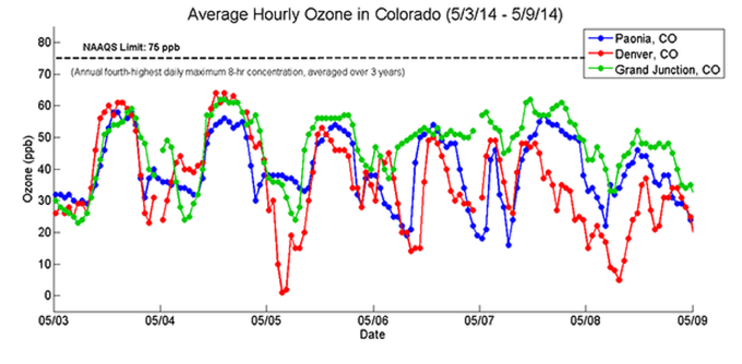
Ozone levels in three Colorado cities over a week.
Copyright 2015 Hannigan Lab, College of Mechanical Engineering, University of Colorado Boulder.
Lesson 4 teaches the students the basics of data analysis and interpretation using Excel.
The corresponding video series Data Analysis for Excel is intended to supplement this lesson.
The main learning objectives are for the students to be able to:
Learn basic Excel commands for data analysis
Make graphs and charts on Excel
Interpret air quality data and draw conclusions based on their results
This module includes:
Pre-Activity Reading
Data Analysis Activity with Excel Data Sheets
Excel Cheat Sheet