
Visual Identity
Colors
Primary Palette
The official CU Boulder colors are CU Gold, Black, CU Light Gray and CU Dark Gray. Use these on all branded materials to ensure visual consistency.

CU Gold
C0 M10 Y48 K22
(PANTONE® 4525 C)
R207 G184 B124
#CFB87C

Black
C0 M0 Y0 K100
R0 G0 B0
#000000

CU Dark Gray
C38 M28 Y21 K63
(PANTONE® 425 C )
R86 G90 B92
#565A5C

CU Light Gray
C16 M11 Y11 K29
(PANTONE® 422 C)
R162 G164 B163
#A2A4A3
Secondary Palette
The secondary colors of CU Boulder are Accessible CU Gold, CUB Sky Blue, CUB Light Gold, CUB Dark Blue and CUB Light Blue. Use secondary colors less frequently than primary colors on all branded materials.

Accessible CU Gold
C40, m47, y93, k18
R141, g115, b52
#8D7334

CUB Sky Blue
C89 M54 Y7 K0
R9 G112 B174
#096FAE

CUB Light Gold
C3 M3 Y7 K0
R243, G240, B233
#F3F0E9

CUB Dark Blue
C100 M78 Y41 K33
R11 G56 B88
#0A3758

CUB Light Blue
C5 M1 Y1 K0
R238, G245, B247
#EEF5F8
Usage and Accessibility Guidelines
Accessible design is good design. When developing designs and layouts, consider that some viewers or audiences may have limited sight ability and could be using assistive devices. Therefore, all designs must have sufficient contrast when incorporating type and design elements.
- Use primary colors, especially CU Gold, on all branded materials to ensure visual consistency.
- CU Gold is not accessible on a white background.
- Accessible CU Gold is for text color on white backgrounds only. Do not use it as a background color.
- When using Accessible CU Gold for text, use Helvetica Neue 77 or thinner.
- Use secondary colors less frequently than primary colors in any branded materials.
- Use CUB Sky Blue for text color only. CUB Sky Blue can bring emphasis to “call to action” text on branded material.
Brand Color Accessibility
The color combinations above meet WCAG accessibility standards for large (14pt and above) and small text.

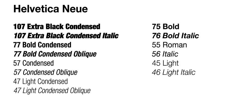
Typography
The primary brand typeface for CU Boulder is Helvetica Neue. You can use this face in all of its weights and styles as a display face in official communications and print collateral.
Usage Guidelines

Primary
Helvetica Neue Condensed and Regular are the primary CU Boulder fonts. We do not use other variations of these fonts. Both primary fonts contain many weights as shown below.
You may use the many weights of Helvetica Neue to create a strong typography hierarchy. Consider the importance of the information you are presenting and ensure priority text is clearly designated through type choice.
- The following text can ONLY appear in our primary fonts: Website URLs, “CU Boulder,” “University of Colorado Boulder,” “Buffs” and “Buffaloes”
- We recommend using Helvetica Neue Condensed for headlines in either 107 or 77 weights.
- When using accessible gold text, do not use heavier than 77 weight.
- For body copy, Regular 45 light/55 roman is standard.
If you did not receive access to the Helvetica Neue font when onboarded on your CU device, and the font access is required to fulfill your job duties, you can fill out this form to facilitate access. Please note, if you have access to CU's Adobe Creative Cloud, you will be able to automatically use multiple weights of Helvetica Neue.
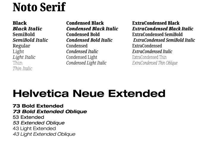
Secondary
CU Boulder also uses Noto Serif and Extended Helvetica Neue as secondary fonts. Ensure all secondary font use remains secondary. There should always be more primary font use (Helvetica Neue Condensed and Regular) in your design than Noto Serif or Helvetica Neue Extended combined.
- All variations and weight of Noto serif are acceptable to use.
- Long-form print pieces may use Noto Serif as body copy.
To access Noto, the fonts can be found here.
Photography
Usage Guidelines
CU Boulder branded photography must capture the spirit of CU Boulder—its collaborative energy, stunning campus and dynamic learning environments. When taking photos or videos for CU Boulder materials, focus on:
- Capturing peak action and emotion, like classroom “a-ha” moments.
- Prioritizing natural light, especially from windows.
- Using simple, bold compositions to make subjects stand out.
- Find creative, distortion-free angles for ordinary scenes.
- Shoot for natural personality with candid expressions and closeups.
- Incorporate subtle branding, like CU apparel or iconic campus locations.
When including photos in branded materials:
- Balance full-bleed imagery with ample negative space in the design.
- Campus texture photos may also be “graphic elements.”
- Scenics, textures, landscapes and low contrast imagery work best as graphic elements to create visual interest without distracting from adjacent content.
- Full-color and black and white photos are both permitted.
- Mixing use of these two photo styles on the same page or within the same material should be done sparingly and with intention.
- Subtle grain or halftone textures can accent photos.
Authentically CU Boulder


Candid Portraits


Dynamic Learning


Campus Scenics and Textures


A selection of CU Boulder photography is available for affiliate use on our Brand Toolkit page.
Icons
Icons can be a helpful design tool for adding visual interest and emphasis to a layout, as well as providing a quick understanding of associated information. Icons should guide a user or reader to the information they are looking for. You may use icons on any branded material.
Usage Guidelines
- Icons should never represent an individual group or department. Always use the group or department’s logo rather than an icon if needing a graphic.
- Never use icons as logos or as part of a Type Treatment.
- Simple, less detailed, one-line (unfilled) icons are preferred.
- For print applications, icons should range in size (using a square for reference) from 5/16” to 3/4” (.3125in to .75in).
- For digital applications, icons should range in size from 72px to 200px.
- Use accessible color combinations when placing icons on all backgrounds.
- Only use solid icons if needed over busy backgrounds for readability.
- Avoid mixing one-line and solid icons in the same design or immediate vicinity.
- You may use icons within CU brand kits or source relevant icons from sites like Font Awesome.
- When sourcing stock icons, do not select icons that are too busy, overly detailed or have fine lines. These icons will pose issues for many printed materials and do not align with the CU brand kit style.
- When pulling multiple icons into one design, especially from various sources, ensure all one-line icons maintain the same stroke/line weight for consistency.
Graphic Elements
Usage Guidelines
CU Boulder designers and content creators should gravitate toward these kinds of graphic elements, sourced from brand kits or stock sites:
- Paper textures including paper grain, wrinkles and rips.
- Must be in neutral primary colors (white, off white, black or gray).
- You may use stickers or sticker-like images as graphic elements.
- Accent with thin, simple, hand-drawn line illustrations.
- Lines, circles, stars, brackets or other appropriate imagery that would be doodled can add energy to a design.
- You may use a thin horizontal line in a brand color to separate elements or add extra emphasis. This line may be hand-drawn or perfectly even, but it should always be thin (~2pt stroke or lower).
- Solid color overlays aid with readability or unify color on a page.
- Use overlays on photography, patterns or text to emphasize or bring visual interest to a specific element.
- Use in primary or secondary CU brand colors.