Campus Lockups and Marks
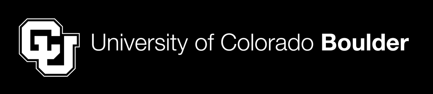
Main CU Boulder Lockup

The CU Boulder signature includes two elements: the logomark (interlocking “CU”) and the wordmark (university name). CU Boulder’s logo is often called the “lockup,” which refers to the requirement that the interlocking “CU” and “University of Colorado Boulder” must remain together.
Logos and Be Boulder. graphic marks for schools, colleges, units, programs, centers, institutes and officially licensed student groups are part of CU Boulder’s logo system. When used collectively and consistently, the marks provide a clear and strong unit or group identifier while also positively impacting the recognition of CU Boulder’s brand.
CU Boulder schools, colleges, units, programs, centers, institutes and officially licensed student groups all qualify to have a lockup created for them as a courtesy through Strategic Relations and Communications. You can request a lockup through our brand request form.
Lockup Variations
The full color, left-aligned lockup is CU Boulder’s most commonly used logo. If the left-aligned lockup is too long for the material you’re producing, the full-color centered lockup may better fit the space, such as in vertical layouts like a tall printed banner or a 160x600 digital ad.


Color Variations
There are four color variations: full-color, full-color reversed, one-color black and one-color reverse (white). These variations exist to meet needs across different materials. Only use one-color lockups for one-color printing.


Shortened Lockups
Shortened lockups, or “shorties,” exist for use on smaller merchandise (pens or sunglasses), digital ads, video bugs and other applications that are low on space. “Shorty” lockups are provided in the same color variations as the regular lockups.


Sizing and Placement
When adding a lockup to CU materials, imagine the mark as a university “sign off” on the bottom right or left of the design. When placing the mark, adhere to these guidelines for placement and sizing:
Clear Space
Maintain the designated “clear space” to ensure the mark has room to breathe wherever it is placed. We measure the minimum “clear space” by the height of the “U” of “University” in the wordmark.


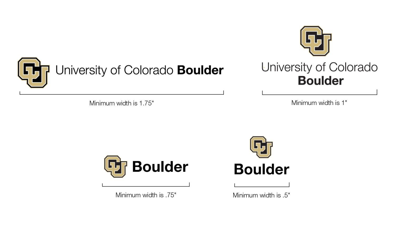
Minimum Size
The following diagrams depict the smallest possible size for each lockup. This is to ensure readability and balance in design.
Usage Guidelines
- Do not alter the lockup’s fonts and colors.
- The lockup must always have the minimum clear space around it. This ensures the lockup is easily visible, stands alone and does not look like part of any other content or imagery.
- Departments, organizations, programs, etc. cannot have individual logos instead of the lockup.
- A lockup must be on all branded materials.
- Exceptions: If the user/audience is already seeing a lockup, there’s no need to add another. For example:
- Main channel social media posts (lockup is already present in icon)
- In an email header or footer
- Exceptions: If the user/audience is already seeing a lockup, there’s no need to add another. For example:

Be Boulder. Marks

Be Boulder. is one of the core elements used to express CU Boulder’s visual identity. To establish a consistent, strategic brand, please always use approved artwork. Do not, under any circumstances, attempt to match this letterform with other typefaces, no matter how similar they may appear. This will ensure the consistent use of the Be Boulder. mark in all applications.
Color Variations


Usage Guidelines
- Used as a sign-off. Should not be used in headers/subheads.
- Intended for use on branded materials for recruitment audiences.
- Must be used with a CU Boulder lockup with ample space between the two.
- Always use approved artwork. Do not under any circumstances attempt to match this letterform with other typefaces.

Sizing and Placement
Clear Space

The clear space required around the mark must be at least half the height of the 'B' in Be Boulder.
Minimum Size

Athletics Marks
The CU Boulder Athletics designs are reserved specifically for athletic contexts like uniforms, websites, posters and spirit gear. Only the Athletic Department and spirit gear can use these designs alone. Follow the same sizing, spacing and color guidelines as with the CU Boulder lockups.
Ralphie

Athletics Interlocking CU