
Learning by design: STEM infographics help students, teachers cultivate scientific inquiry
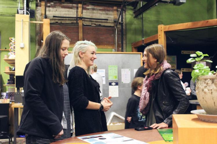
Animas High School students present their infographics at the community showcase. Courtesy of Animas High School.
In recent years, Steve Smith’s chemistry class at Animas High School has traded in their beakers and Bunsen burners — at least for one impactful unit — in favor of complicated datasets and graphic design software.
Through the STEM Literacy through Infographics curriculum, students often take on the role of a science journalist, and they are invited to embark on scientific research and author infographics about STEM — Science, Technology, Engineering and Math — topics that personally interest them.
The STEM Literacy through Infographics project is part of a four-year collaborative study led by the University of Colorado Boulder, Simon Fraser University, Saint Louis University, TERC and teachers in Colorado, Missouri and Massachusetts, and the results have been promising.
Through the project, teens make empirically backed and visually appealing scientific arguments, rather than simply parroting content. These learning experiences cultivate science inquiry to answer questions that are relevant to the students’ lives and their community.
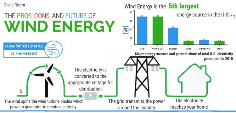
In Smith’s class in Durango, water quality and quantity on the Western Slope of Colorado are of the utmost importance to the mountain town. Several students chose to look at the water issues, including the remodeling of a local water reclamation plant and even the effects of the Gold King Mine spill, the 2015 acid mine drainage spill in nearby Silverton that made national headlines by temporarily turning the Animas River orange.
In Smith’s school, students had opportunities to work with a professional editor to get their infographics published on the Scijourner website, and all of their infographics were presented to peers, families and local experts at a community event hosted at the Powerhouse, the local science museum.
“At the public exhibition, our students could receive immediate feedback from the public and local professionals,” Smith said. “That’s a continued learning step that you just don’t get if you turn in a paper.”
Over the course of a study involving 21 teachers and 1,200 students, researchers have found similar sentiments from teachers who have incorporated the project curriculum across 10 different school sites in classes ranging from genetics to statistics. Researchers found that when young people investigate a topic that interests them and create an engaging infographic, they are better able to make sense of the data and see science as relevant to their lives and everyday experiences. Classes underscore an important skill that can be overlooked in science — the ability to communicate the implications of science for society.
The teachers and researchers involved in the project found that students now know how to find, synthesize and analyze credible science information and use computer technologies to visually and graphically represent data and ideas. Through the semester-long research projects, students left with a publishable visual artifact and a developing identity as someone who has the capabilities to use analytic and graphic design tools to express complex ideas and arguments.
“Our research indicates that not only does the incorporation of data visualization and infographic design engage students’ personal interests and promote agency to communicate issues that matter to them, it also has been shown to challenge students assumptions, question their previously held beliefs, and update their conceptions about science related phenomena,” said Joseph Polman, the project’s principal investigator and professor of learning sciences and human development in the CU Boulder School of Education. Polman's collaborators include Engida Gebre, Cynthia Graville, Rob Lamb, Alan Newman, Andee Rubin, Ada Ren, and current and former CU Boulder doctoral students Joanna Weidler-Lewis, Stephen Sommer, Chelsey Shade, and Leighanna Hinojosa, who have developed the program with teachers and have conducted research.
“We have seen that structured feedback focused explicitly on non-textual, visual representation has improved students' ability to communicate multi-modally," Polman added. "And, teachers seem particularly pleased that infographic projects engage students across disciplinary boundaries and content material.”
For Smith, the project has been rewarding, and he would recommend it to other educators.
“I think there are two reasons teachers should consider using infographics in the classroom,” he said. “First, there are several mechanisms to create more student motivation and buy in through the use of infographics, and second, they are great for promoting information literacy and scientific-thinking skills.”
The STEM Literacy through Infographics website offers a public repository of teacher testimonials, curricular resources, online teacher professional development tools and also extensive support for finding, using, and visualizing data. Smith said he enjoyed the opportunity to be a part of a large national study and to continue his education with a cohort of other dedicated educators. He remembered fondly the hands-on 3D data literacy workshop for educators at the beginning of the project that allowed educators to ask questions that their students would later face.
“We had straw, yarn and data, and we needed to answer, ‘how do you visually represent these data?’” Smith said. “It forced you to think.”
This material is based upon work supported by the National Science Foundation under Grant Nos. IIS-1441561, IIS-1441471, & IIS-1441481. Any opinions, findings, and conclusions or recommendations expressed in this material are those of the author(s) and do not necessarily reflect the views of the National Science Foundation.