Dimensions of Data
To Jordan Wirfs-Brock (MJour’10), data points on a graph and cascading notes on a piano can tell similar stories.
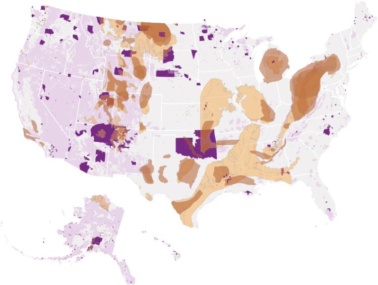
As the United States expanded west, claiming territory across North America, Indian tribes were pushed onto progressively smaller areas of land. Today, Indian reservations comprise 326 separate areas and 56 million acres of land. As shown here, many Indian lands include extensive coal, oil and gas deposits.


Indian reservations and areas

Federal lands

Tight oil and gas formations (shale)

Coal deposits
“Once you start thinking about sound and the ways that sound is used to convey information, you’ll notice it everywhere,” says Jordan Wirfs-Brock, an information science doctoral student who explores how audio and visual tools can better connect audiences to data.
After earning a master’s degree in journalism from CU Boulder, Wirfs-Brock worked for three years at Inside Energy. As a journalist often reporting on complicated, data-oriented issues, she kept running into an intriguing question: What is the best way for people to receive and understand complex information?
One solution she found was music to her audience’s ears.
For a story on declining coal production, she created an audio graph on the varying rates of weekly U.S. coal production between 1984 and 2016. Rather than reading off statistics, Wirfs-Brock used notes on a piano to represent the data.
Production spikes are played as high notes, while production lulls are played as low notes. The resulting cascade of sounds rises for the early 2000s, lowers slightly after a peak in 2008, and then dramatically drops after 2015. For 2016, the notes are a series of low, ominous thuds representing a 30-year low in coal production as both coal jobs and companies began to disappear.
As the volume of data people create and collect has grown, data communication has become a rising field with implications for everything from traditional news stories to home design. It’s a trend that excites Wirfs-Brock and leaves her constantly searching for new ideas and solutions.
Through new technologies, she says, users could soon hear ambient sound data that tells them how much energy their house is using. Or, they could listen to similar audio graphs while Alexa or Google Home give them their morning news briefing or financial stock update.
“If we’re shooting for the moon, I want to help develop technologies that will lead to a better future of journalism,” she says. “How do we bring data into the conversation in a way that encourages people to ask questions?”
As she imagines the possibilities for audio-based information, Wirfs-Brock is also identifying ways to make information more visually compelling.
In 2018, she won first and third place in the University of Colorado Libraries inaugural data visualization contest, with entries highlighting newsworthy events she had covered in the past.
The first-place winner, “Indian Lands and Fossil Fuel Resources,” was created during the Dakota Access Pipeline protests at the Standing Rock Indian Reservation. The third-place winner, “Mapping Colorado’s Invisible Pipeline Network,” was an Inside Energy interactive mapping project that showed where oil and gas flowlines might intersect with buildings around Colorado. The map was a response to a fatal explosion at a home in Firestone, Colorado, caused by leaking gas from an inactive flowline in April 2017.
Wirfs-Brock’s advisor, information science Assistant Professor Brian Keegan, says he’s fascinated by the range of skills she uses to communicate information.
One day, she is scraping data or writing code for websites and interactive tools, and the next she is drawing on her experience as a journalist to spot newsworthy topics and conduct participant interviews, he says. Then, with her sense of design, Wirfs-Brock can take that information and create an engaging visual experience for an audience.
“I wish I knew what her secret sauce was that let her pull all these different strengths together,” he says. “I think people like Jordan are poised to be the leaders, to set the agenda for what journalism can be as it starts to happen... beyond the screen, beyond the paper.”
According to Wirfs-Brock, the interdisciplinary nature of information science is part of what drew her to the field in the first place. It’s an area where she can combine her varied qualitative, quantitative and design skill sets—a balance she has sought for years.
“If you’re someone like me who has lots of eclectic interests, you’re probably not going to see a job description that just describes you. But that shouldn’t deter you from going after it.”
Shannon Mullane graduated with a Master's of Journalism in 2019.

