Be Boulder. Graphic Marks
Be Boulder. is one of the core elements used to express CU Boulder’s visual identity. It is always set in Helvetica Neue Extra Black Condensed (107). Always use approved artwork. Do not under any circumstances attempt to match this letterform with other typefaces, no matter how similar they may appear. This will ensure consistent use in all applications.
Horizontal Non-Stacked Version
The horizontal version is primarily used for headlines and sign offs.


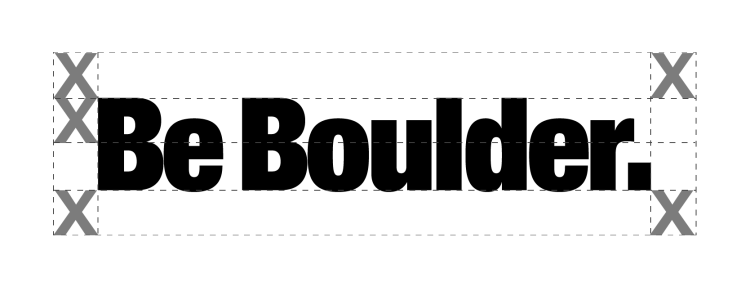
The minimum space required around must be at least half the height of the 'B' in Be Boulder.
Stacked Version


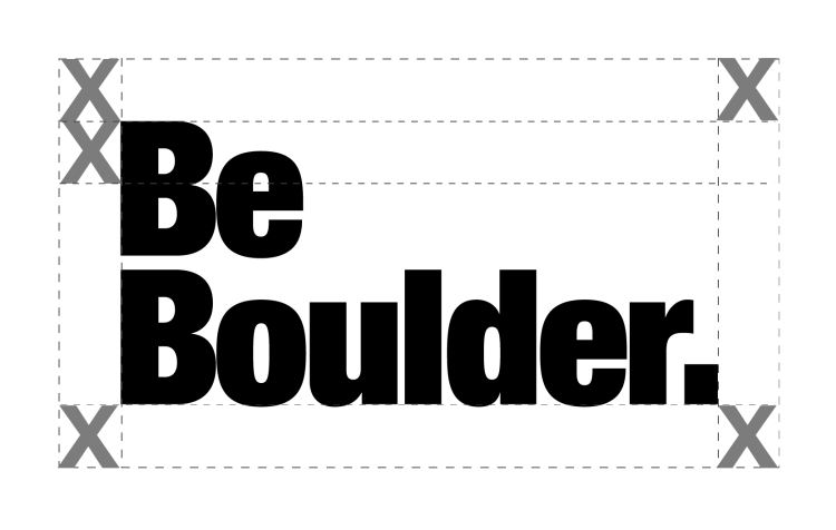
The minimum space required around must be at least half the height of the 'B' in Be Boulder.
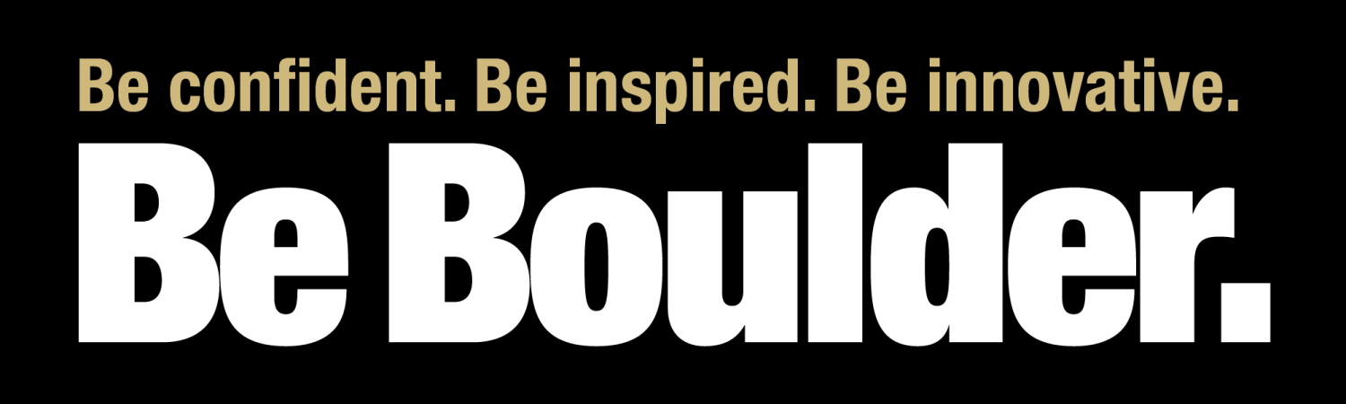
Be statements should be used most often as a headline, with the modifier statements conveying what the CU Boulder experience can help you achieve and become. There should always be three Be statements used with this version; however, Be statements may also be used on their own as headings or headlines. Be statements should always be set in Helvetica Neue Extra Black Condensed (77), Be Boulder is set in Helvetica Neue Extra Black Condensed (107). For statements on a white background, use accessible gold type. For statements on a black background, use CU gold type.

Be Boulder version 2 (Subline modifier) allows each academic department to customize their material while being obvious where it is coming from. The sub-line does not have to be the department’s name, but should relate in some way to the message being conveyed. The sub-line should always have a preposition (“In,” “With,” etc.) in upper and lower case, and the department in upper and lower case. The subline modifier is set in Helvetica Neue Bold Condensed (77). Be Boulder. is set in Helvetica Neue Extra Black Condensed (107). When designing on a white background, use accessible gold type for the department name. When designing on a black background, use CU gold for the department name.