Do's & Don'ts

Because the goal of the Be Boulder platform is to present a single, cohesive message to our internal and external audiences, it is important that all departments, schools, programs, organizations and centers affiliated with CU Boulder work together to abide by the design guidelines of the platform. Below are correct and incorrect design componets to keep in mind when creating a project. 

Logo Guidelines:


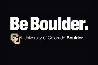
  Do: Lock up the CU Boulder logo below the tagline. Use artwork provided rather than reproducing it yourself.


Be Boulder. tagline with lockup below

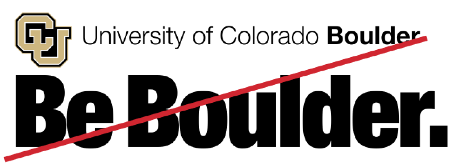
  Don’t: Lock up the CU Boulder logo on top of the tagline. Use artwork provided rather than reproducing it yourself.

Be Boulder with the CU lockup above

  Do: Set the tagline in initial caps. Use artwork provided rather than reproducing the tagline yourself.


Be Boulder

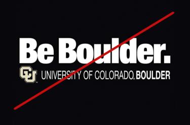
  Don’t: Set the wordmark in all caps. Use artwork provided rather than reproducing the tagline yourself.

Be Boulder in all caps

  Do: Right align the specific unit with the bottom right of the "r" in Be Boulder.

   Don’t: Center align the wordmark lockups.


Be Boulder with the tagline incorrectly center aligned

  Do: Use lowercase letters for the second word in the "Be" statement.

Be statement second word correct with lowercase letters

  Do: Use lowercase letters for the second word in the "Be" statement.

Be statement second word incorrect with uppercase letters

Merchandise Guidelines

  1. University lock-ups should not be altered in any way. They need to either be left-justified or centered.
  2. The interlocking CU cannot be used by itself or have any artwork behind it or used in conjunction with it. There needs to be a clear space around the lock-up the height and width of the “U” in the interlocking CU when used in conjunction with any artwork
  3. University lock-ups cannot be used in any color besides approved branding colors. See approved colors
  4. The wording “University of Colorado Boulder” needs to be printed in a branded font.
  5. Any use of the Ralphie artwork needs to be approved by JT Galloway: Jt.Galloway@Colorado.EDU
  6. There should be no trademark symbols associated with official university lock-ups or the wording “University of Colorado Boulder” or “CU.”

Examples


  Do: Separate any artwork from the university lock-up. The university lock-up must be used with enough clear space around it.

International Student Scholar Services logo good example

  Don’t: Alter the university lock-up in any way. It needs to be printed in a straight line either left-justified or centered.

International Student Scholar Services logo bad example


  Do: Use the lock-up provided to you by Strategic Relations and Communications.

Be Boulder logo good example

  Don’t: Create your own lockup with unbranded fonts. 

Be Boulder logo bad example


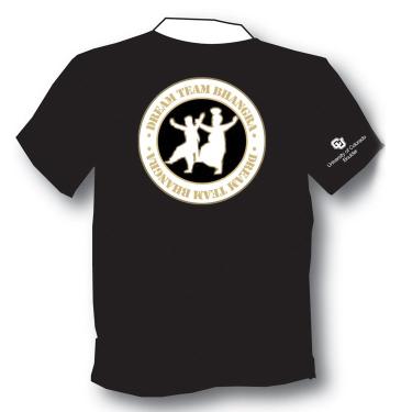
  Do: Separate group artwork from the university lock-up. In the example, the lock-up is on the sleeve to show association with the university.

Dream Team Bhangra logo good example

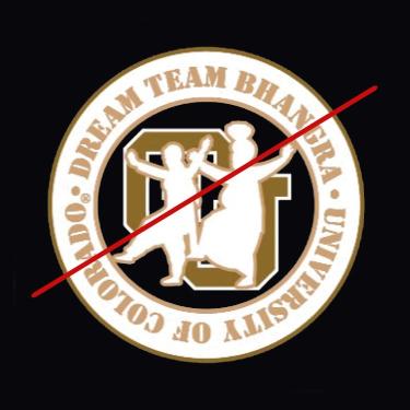
  Don’t: Change the branded font used for University of Colorado, place artwork over the interlocking CU or use "University of Colorado" by itself.

Dream Team Bhangra logo bad example


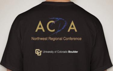
  Do: Include the university lock-up (with adequate clear space around it) to show association with the university.

ACDA Northwest Regional Conference logo good example

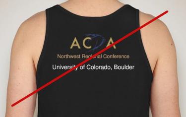
   Don’t: Change the University of Colorado font. It needs to be in a branded font.

ACDA Northwest Regional Conference logo bad example


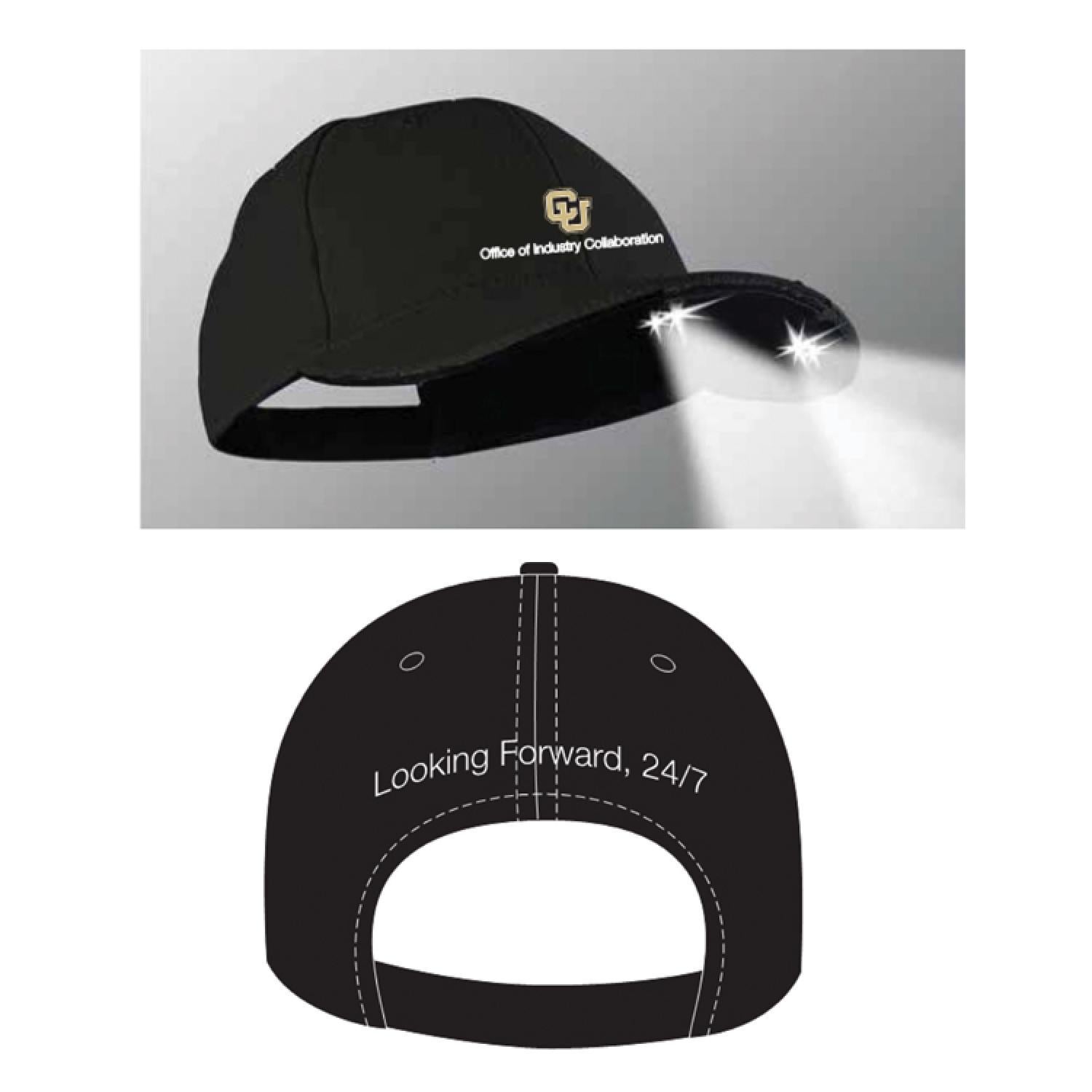
Do: Separate artwork from the university lock-up with enough clear space around it.


Looking Forward logo good example


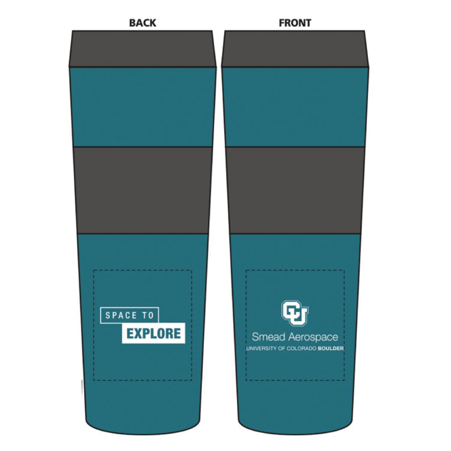
Space to Explore tumbler good example


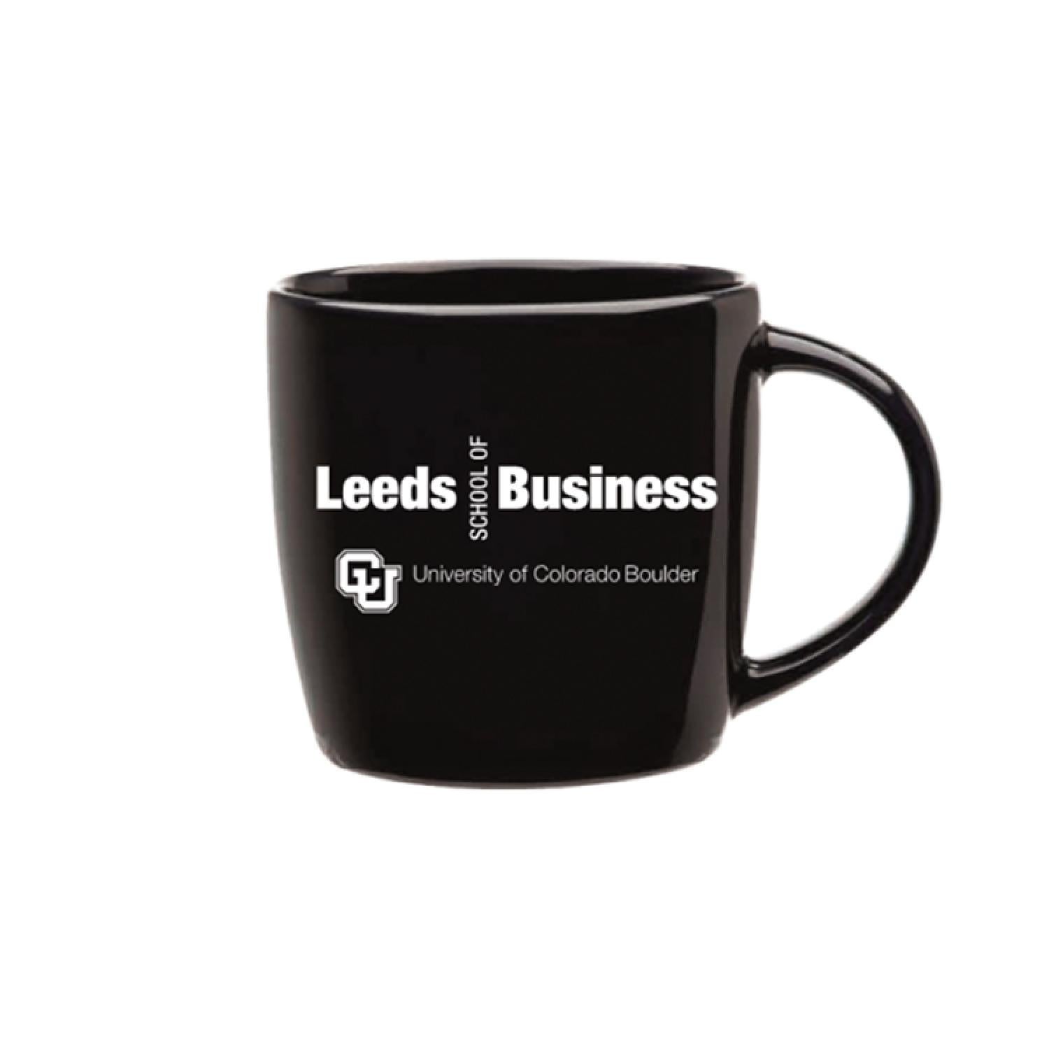
Leeds mug good example


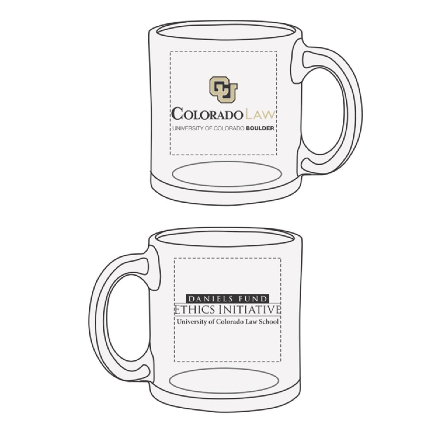
ColoradoLaw mug good example