Creating Tactile Graphics
About
The goal of a tactile graphic is to convey the essential message or concepts contained in a work. Creating tactile graphics can be as simple as adding raised lines to an illustration, or as complex as original designs that meet national standards for tactile learning. The effective use of textures incorporates nuances around contrast, height and orientation to provide it's own tactile vocabulary. This quick guide is meant to provide the basic elements to consider when adapting a graphic or illustration.
Download printable version of Tactile Design Elements
Focus
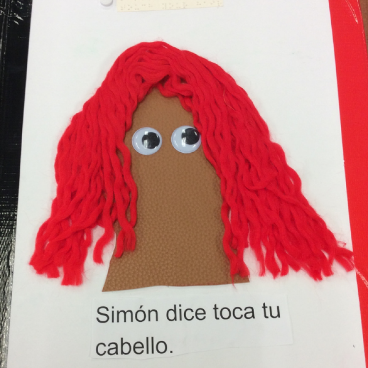
- Stay focused on the most important features that represent the subject
- One element per page, especially for early learners; more can be added with increased tactile literacy
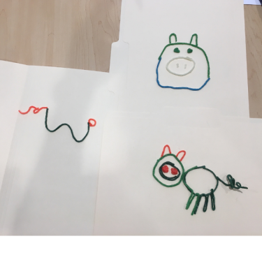
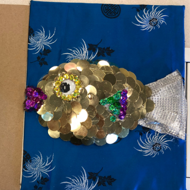
- Highlight just a cat’s whiskers instead of the furry body, or use only a pig’s curly tail to represent the pig
- Eliminate visual clutter such as detailed backgrounds, intersecting lines, borders, clothing details, complex perspectives, etc.
| What makes a pig? | Essential story elements from the book Goodnight Moon |
 |  |
Texture
- Use a variety of textures in the same way color is used to differentiate objects
- Use accurate or representative textures that make sense
- Use fake grass or leaves for real grass and leaves, not for hair or fur
- Use fur, feathers, and realistic textures for animals
- Smooth, hard, bumpy, soft, squishy - think about the ideas and feelings that these materials convey
- Avoid sharp objects or textures that feel unpleasant or can even cut or hurt someone
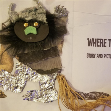
A variety of textures and materials add depth and interest to tactile descriptions of these creatures.
Size & Scale
- Make your objects large enough to feel and explore
- Items that are too small or too detailed are hard to differentiate by touch
- Consider scale in relation to other objects especially when items could feel alike
- Children are smaller than adults; flowers are smaller than trees
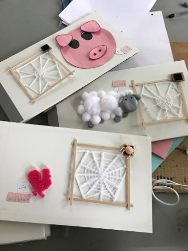 | In this image three different scales are used - both the pig and the sheep are large enough to feel relevant features but it would be better if they were both the same scale and showed only the heads or only the full bodies of each animal. Both are bigger than the spider which is good.
|
Consistency
- Characters and objects should be represented in the same way on each page, otherwise they won’t be recognized as being the same thing
- A character is always identified by a unique characteristic like a curly tail, or pom pom nose
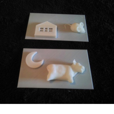
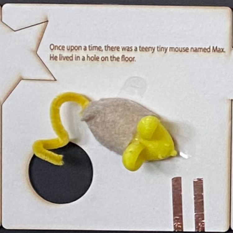
- Create a separate tactile piece like the mouse figure below, that is moved from page to page through the story
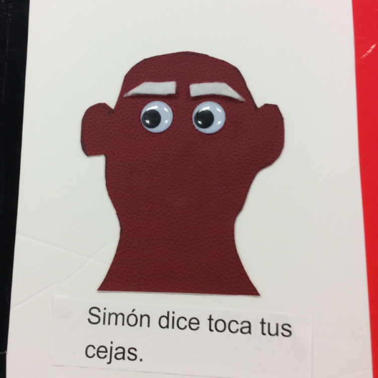
- The head outline and eyes are the same on each page and only the highlighted feature changes
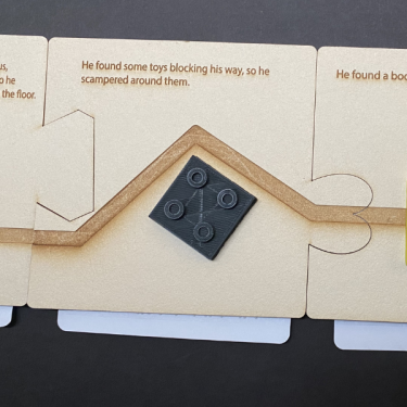
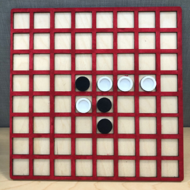
Orientation & Sequence
- Trim the top right corner of a page to orient the reader
- Place buttons and sound triggers in the same location on each page
- If pages are not bound in sequence, incorporate directional arrows or unique connectors to maintain order
| These puzzle links connect the pages in the correct order. | Directional notches in the playing spaces direct the direction of play. |
 |  |
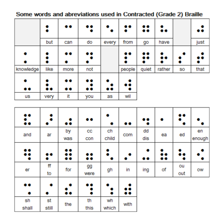
Braille
- Place text and braille in the same location on each page so it can be found easily
- Braille can be printed on clear labels that can be placed over printed illustrations
- Adults and family members often read text along with blind students, so both text and braille are important
- Braille materials have to stand up to high use
- Make sure the texture is pleasant with rounded dots. 3D printed braille can feel sharp and pointy.
- Braille from swell paper or even cardstock will wear down with repeated use
- Use contracted braille and punctuation when possible. Don’t transcribe letter by letter unless for very early alphabet learners.
Color
- High contrast colors on dark or white backgrounds help focus readers who have some color vision
- Use the appropriate colors for an object to help low vision readers and sighted readers who are partnering with a BVI student

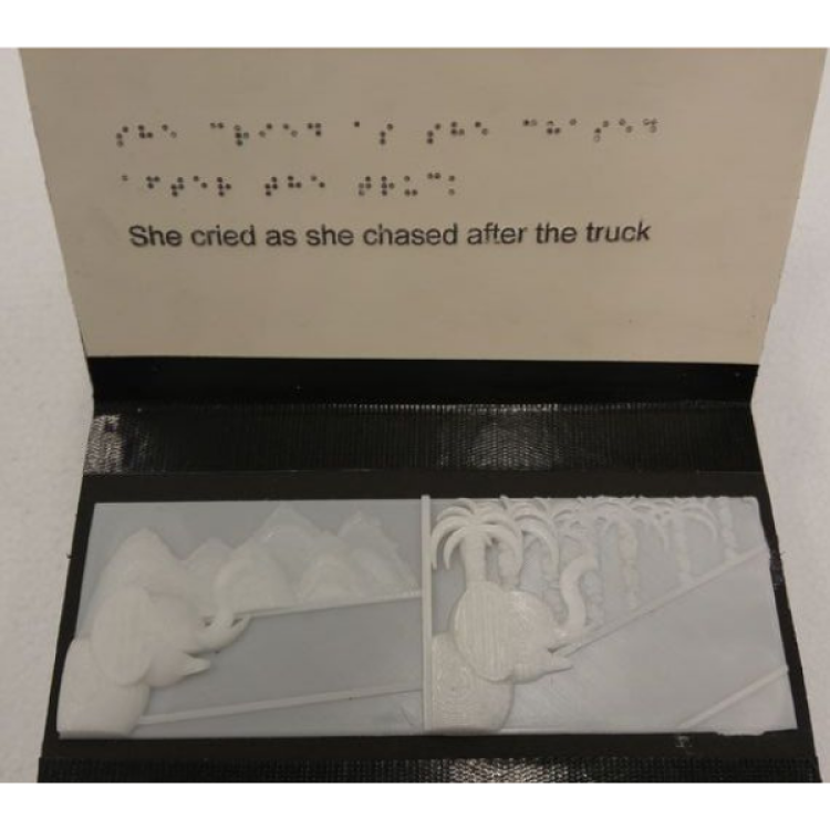
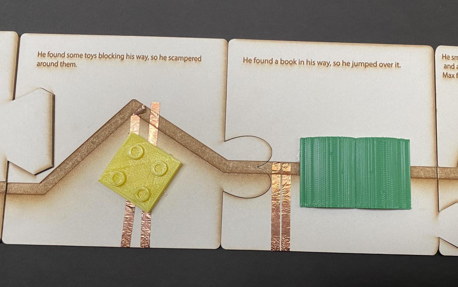
Perspective
- Visual perspective is not easily conveyed through touch
- Consider creating your image on a single flat plane
- Objects on the bottom of the page are considered to be closer to the reader and the top of the page is farther away
- Be consistent in how perspective is used throughout the project.
In the example below, the reader moves a mouse along a path that goes around the toy block, and the path is interrupted as it goes over the green book.
Tactile Diagram Resources:
The Braille Authority of North America (BANA) has developed guidelines for tactile graphics.
Perkins School for the Blind Paths to Literacy blog includes numerous articles on tactile books.
- Tactile Books for Students with Visual Impairments
- Design Principles for Tactile Graphics
- Understanding Tactile Graphics
- Guide to Making a Tactile Diagram
- Creating Tactile Graphics from Teaching Students with Visual Impairments website