Video
Video produced for or by official University of Colorado Boulder colleges, departments and institutes should follow consistent visual elements (logos, type, etc.) as laid out in these guidelines. Larger fonts should be used when necessary for legibility in smaller venues (phones, small players, etc.)
Closing Animation (Bumper)
Here are a couple of examples of an animated closing sequence that have been created for use by departments. The files are available for download through the digital asset request form.
Black Background With University Logo:
White Background, Unit-specific Lockup (Engineering):
These examples are shown at 10 seconds in length, but they can be trimmed to a shorter duration. To allow for recognition and recall, the closing sequence should not be shorter than 3 seconds.
Opening Title
Research on user behavior shows that videos with opening titles are less likely to be viewed in their entirety. We recommend using a closing animation rather than an opening title. An example of a branded title using a campus logo is shown below. The image may be made transparent and overlay an opening image if needed. Again, using a opening title is not recommended.

Titling
The overall approach to text titling for video projects following the campus brand is to present a very clean, simple and flexible look. Text titles should generally convey only the most necessary, easily understood information and should not distract from the visual or narrative material in the piece. This style is most similar to a clean documentary film titling aesthetic, providing only key information in a very straightforward way. This style is deliberately not similar to common broadcast news lower-third graphic styles. Do not include an interlocking CU logo graphic (or any other logo graphic) with text titles.
There is no set template to be used for titling, as each project’s needs are different and there may be special circumstances from shot to shot. However, there is a specific set of guidelines for the editor to create consistent, brand-compatible titles.

Font
All text should be Helvetica Neue, with Bold style enabled. This is the official branded font of the university.
Sizing may vary as needed, but the primary title line—which is almost always the person’s name—should be significantly larger than any secondary lines. Conversely, no title text (either primary or secondary) should be smaller than size 50. Common examples of primary/secondary line font sizes include 120/55 or 85/50.
Whenever possible, limit titles to two total lines of text (a primary and a secondary line). If absolutely necessary, add an extra secondary line for a person with a complex title or multiple roles/identities that are all essential to the story. Lines of text should line up with each other flush left. In some cases, lines may be centered relative to each other.
Color, Shadow and Location
All text should be white. Whenever possible, do not use drop shadows. Place text in an area of the frame where the background is dark or allows the text to be easily readable without drop shadows. This might be over a person’s dark shirt, or off to the side over a dark area of the background. If no such area exists, add a drop shadow to all of the text, with specs: opacity 70 percent, distance = 10px, size = 15px, spread = 40px. Adjust for readability as necessary.
Text can be located anywhere in the frame that is functional and aesthetically appropriate. In most cases it is good practice to have all text appear within the title-safe and/or action-safe areas. This is not a requirement, however, as our primary distribution venue is not broadcast.

Capitalization
Capitalize only the first word of title lines, as well as formal names of people or organizations.
Animation
Use simple fades to animate text on or off the screen, if necessary. In many cases it works best to have a title onscreen immediately when the video cuts to the speaker, making it unnecessary to fade the text in. Titles should appear for at least 3 to 5 seconds, but should not remain onscreen across an edit point in the underlying video.
Consistency
Regardless of the stylistic choices made within these guidelines, make sure that every title is consistently styled. In Adobe Premiere Pro, it is easy to create a new title based on the style of other titles within the same Premiere project, ensuring consistent font and relative sizing.
Common Title Formats
(The examples are not to scale)
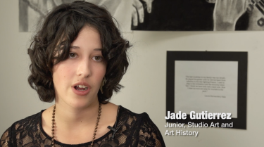
Example: Student Title
Primary = Full Name
Secondary = Year, Full Major
Secondary = Role, Organization (line order depends on relevance to the story)
A complete list of formal major names is available on the academics section of the campus website.

Example: Faculty/Staff Title
Primary = Full Name (Do not include “Dr.” unless they are an MD)
Secondary = Role, Formal Department Name (no abbreviations)
Include the appropriate prefix for professor titles (Asst., Assoc.)
Example: Alumni Title
Primary = Full Name (Do not include “Dr.” unless they are an MD)
Secondary = Role, Company (if applicable)
Secondary = Degree, Discipline (Year Graduated)

