
Layout & Design
Layouts used for CU Boulder should reinforce the Be Boulder tagline. Basic guidelines are listed below.
- Bold layouts.
- Simple, spare, uncluttered and confident.
- Organized, easy to read and understand.
- Intelligent . . . “talk up to the audience.”
- Use of large, simple photography—mostly full-page or full-spread imagery.
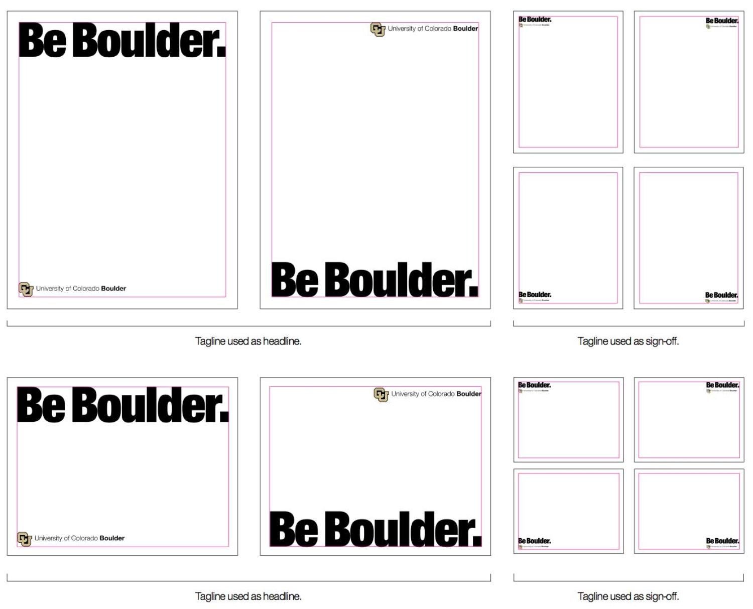
- When the tagline is used as a headline, it should span the width the page, from margin to margin. If photography is used, the placement of the CU Boulder logo should be dictated by the image.
- When the tagline is used as a sign-off, any imagery used should dictate where the tagline is placed. For taglines and lockups, be sure to meet the minimum size and white space requirements.
- 90 percent of colors used should be CU Boulder brand colors.
Example: Before and After
Before
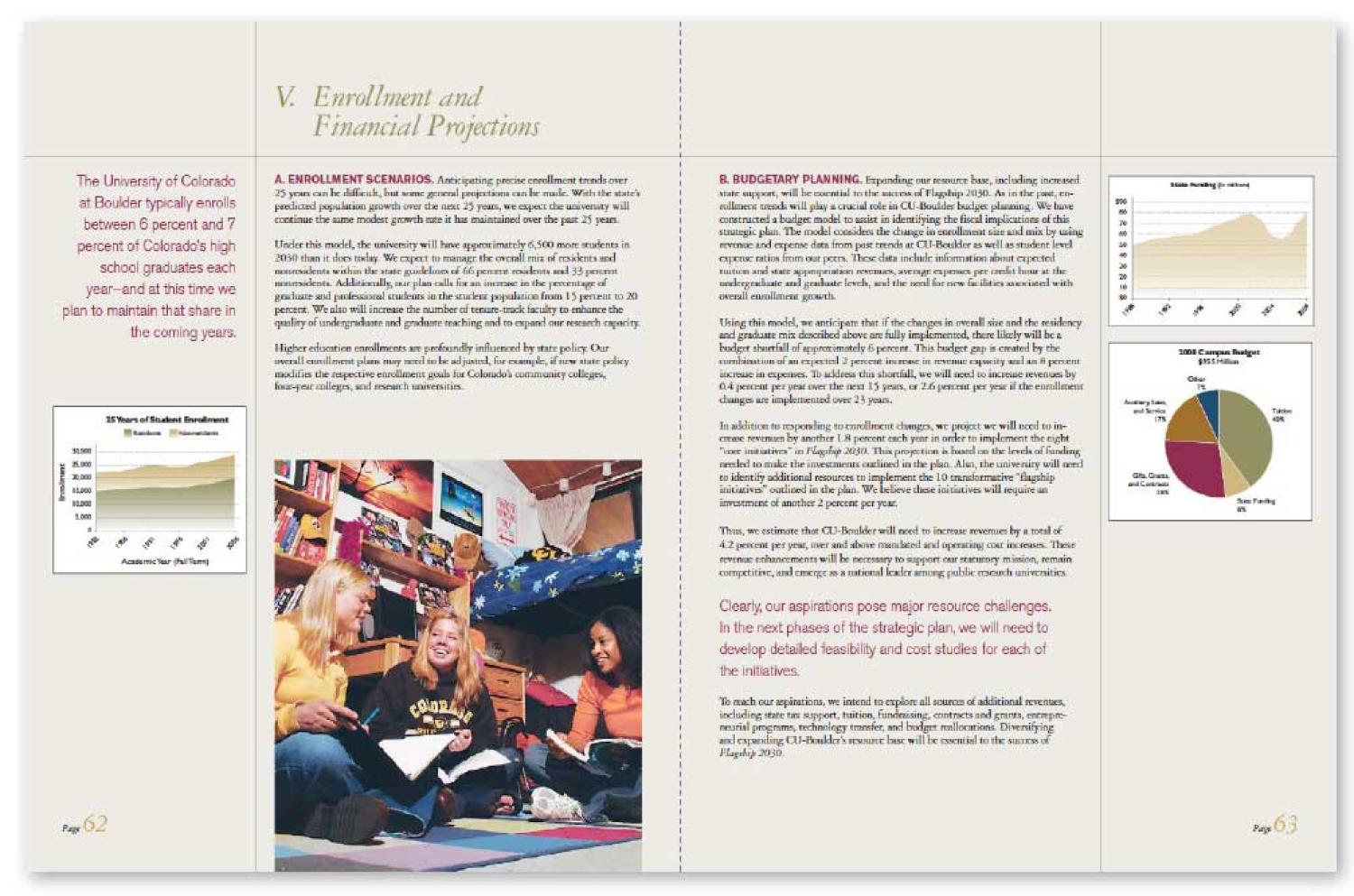
Many areas can be improved by using the Be Boulder style on this publication. Notice how busy the photo is. Even though the bright colors attract attention, it is hard to make out the people from the busy background. The title of the page does not stand out very much. The entire layout is not very engaging, even with the use of graphs and a pull quote. The reader cannot easily scan the text for the most important information.
After

The revised layout, designed in the Be Boulder style, features a photo with a clear subject. The layout is clean with plenty of open space. There is less text and a bold headline to identify the subject of the spread. University brand colors are used in a bold manner to create contrast and interest. The only other nonbrand colors used are present in the vivid photo, which draws even more attention by the use of black, gold and gray. The graphs have been redesigned as infographics to improve interest and readability. The entire piece can be scanned easily to allow the reader to locate the most important information, recognizing that most readers scan pages rather than read every word. Even without the use of a logo or the Be Boulder tagline, the layout feels like a CU Boulder publication.
Example: Before and After
Before
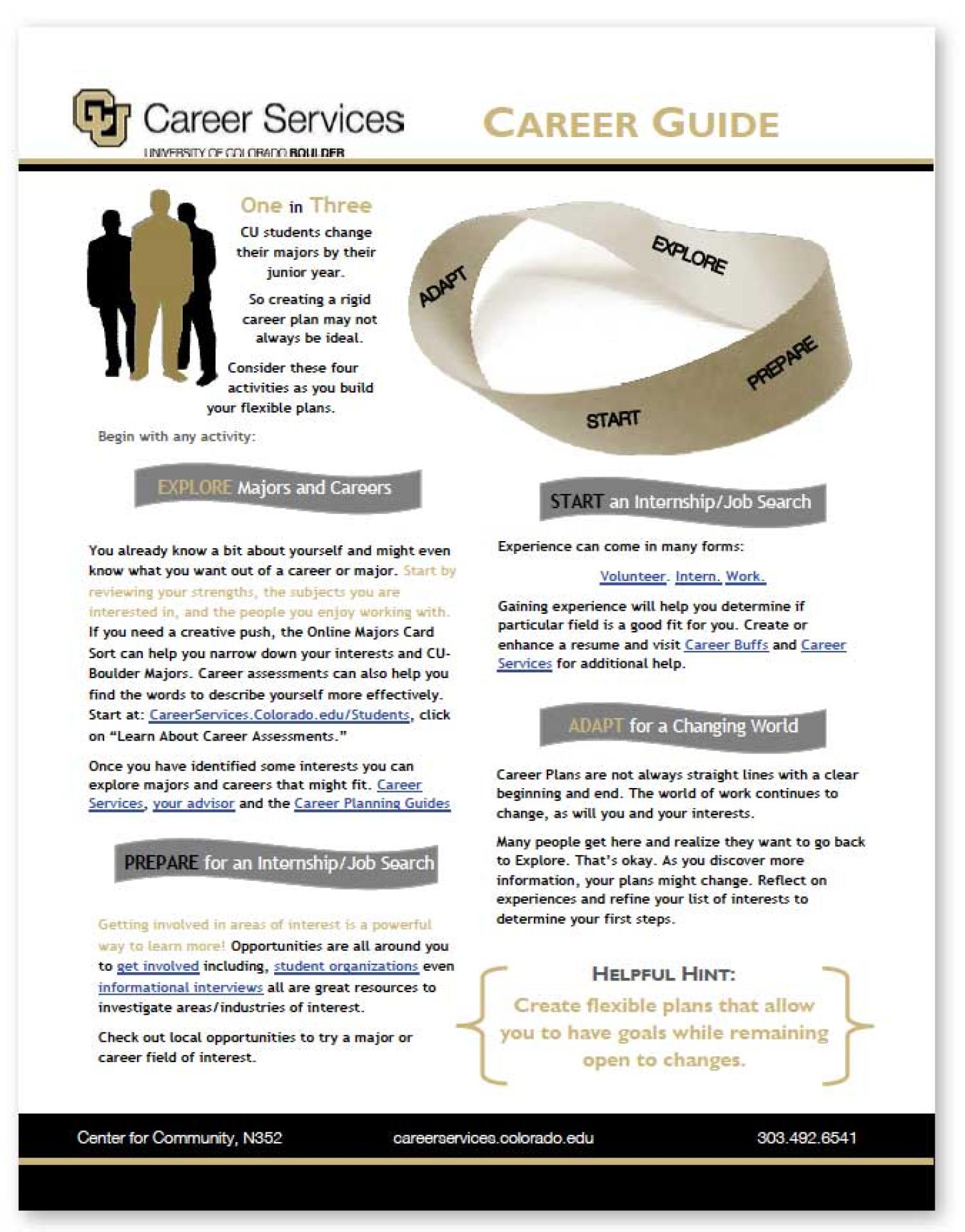
While closer to the Be Boulder style than the previous example, this piece still has a cluttered, busy layout that detracts from readbility. The ribbon graphics used for headings, while attracting attention, impede comprehension. The information presented is not easily scanned and thus not very inviting.
After
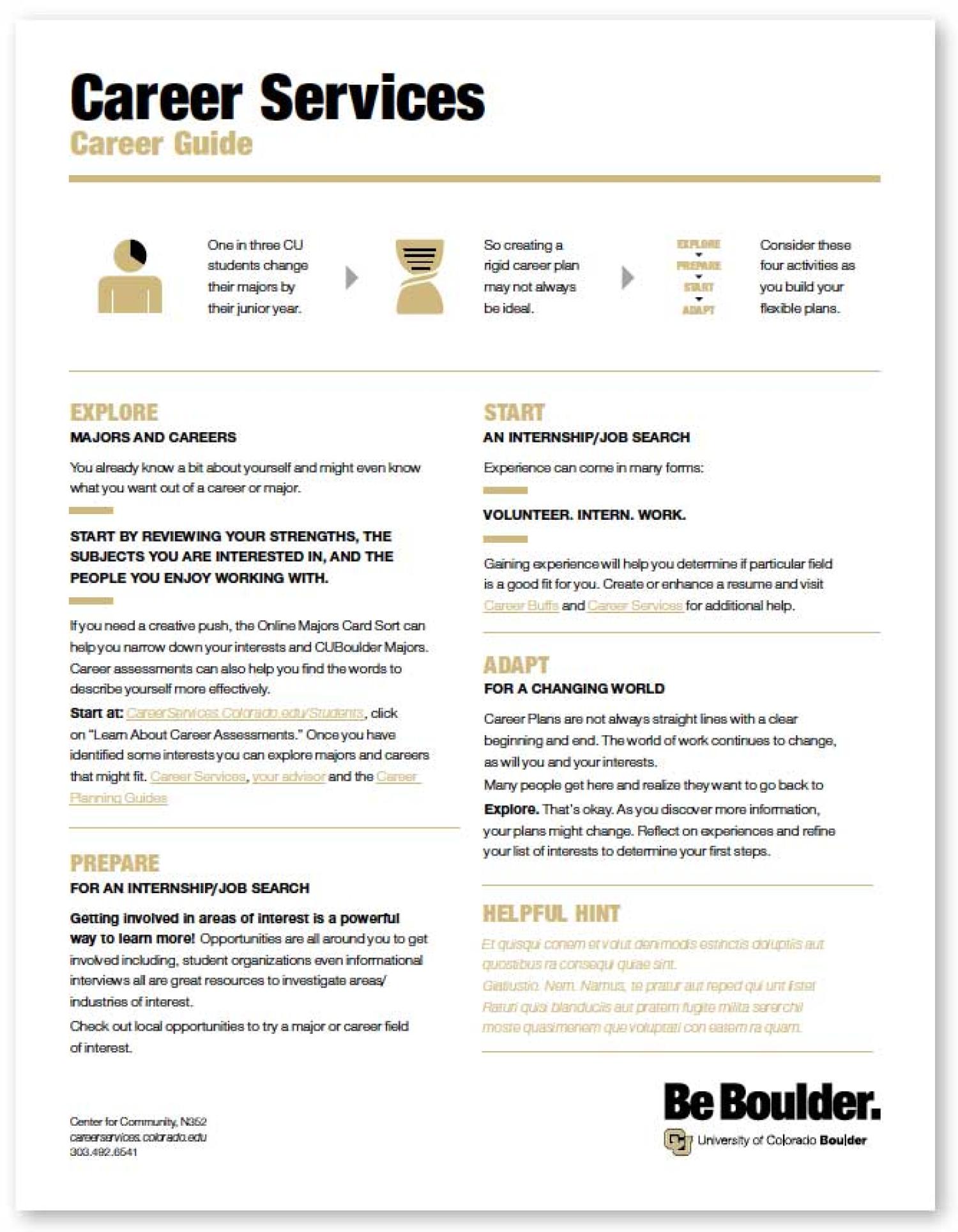
The redesigned piece is bold, clean and easy to read. There is a clear visual hierarchy of importance for the reader, from the bold headline, then to the infographics, the main content with bold titles, and last the Be Boulder tagline and CU Boulder logo lockup. The piece is designed to help students find a career that helps them unlock their potential. This is a great opportunity to use the Be Boulder tagline to reinforce our promise.