The spread of ideas in the scientific community, as modeled like an epidemic, wins the Center for Research Data and Digital Scholarship's 2018 Data Visualization Contest. The contest is an opportunity for students to show off their visualizations and draw attention to their projects. Winners were judged by on ability to communicate insightful information, overall design, technical merit and originality.
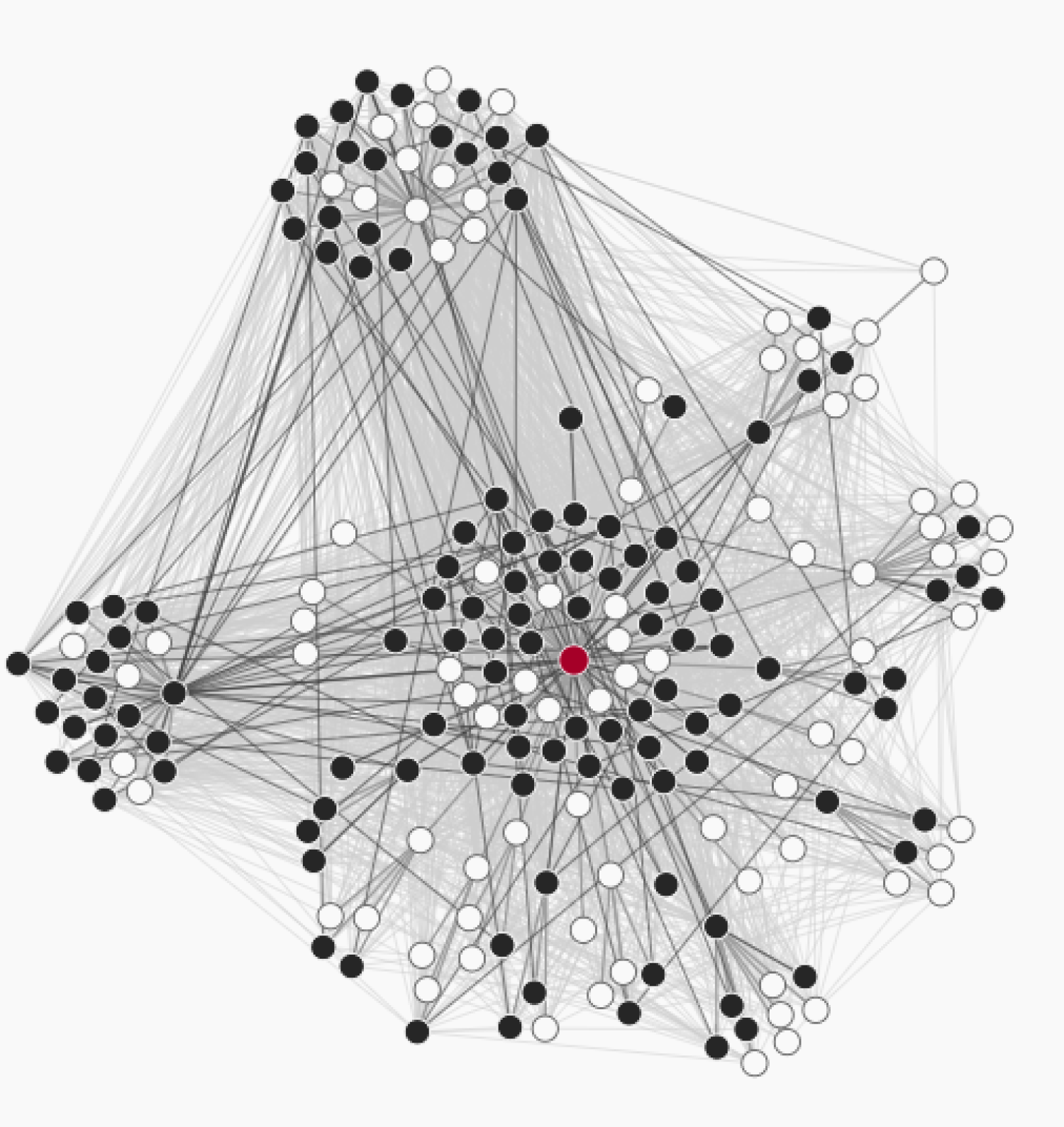 McKenzie Weller’s model, “Simulated Adoption of Research Ideas Originating from Different Universities,” took first place in the contest. Weller is a senior majoring in Computer Science.
“The spread of ideas in the scientific community is often viewed as a competition where good ideas spread further due to greater intrinsic fitness, and publication venue and citation counts correlate with importance and impact of an idea,” Weller wrote in a statement.
However, relatively little is known about how structural factors influence the spread of ideas. Weller used epidemic models to simulate the spread of research ideas, allowing her to quantify the impact of where an idea originates on its long-term spread across the scientific community. She found that research from prestigious institutions spreads more quickly and completely than work of similar quality originating from less prestigious institutions. Even if the idea was low quality, if it originated from a prestigious university, it still managed to spread to a high percentage of the community.
 The second place winner is Julia Uhr with her project, “Modeling Polygamous Marriage Markets.” Urh is an attorney, computer programmer, and Ph.D candidate in Philosophy.
Uhr wrote in a paper about this project, “Before the Supreme Court decided Obergefell in 2015, many people argued that if the Supreme Court declared same-sex marriage a constitutional right, the legalization of polygamy would follow.” Same-sex marriage has become a reality and thus, “the economic costs and benefits of polygamy,” are an important part of the discussion of its legalization. “Determining how both sexes would behave when presented with the option of multiple spouses is an exceptionally complex math problem.” To that end, Uhr created a series of models that simulate different levels of incentive for marriages. Her models assume people are rational and gives only one factor, financial efficiency, to determine couplings. Efficiency is the acknowledged fact that the cost of living with someone is less than the cost of each person living alone. However, Uhr acknowledges that people do behave irrationally and “multiple dimensions determine people’s marriage preferences.”
From these models, Uhr can say that marriage is “only in the financial interest of both parties when the marriage creates efficiencies that compensate the richer spouse for the poorer spouse’s lower income, and the more efficiency a marriage creates, the more total marriages occur.”
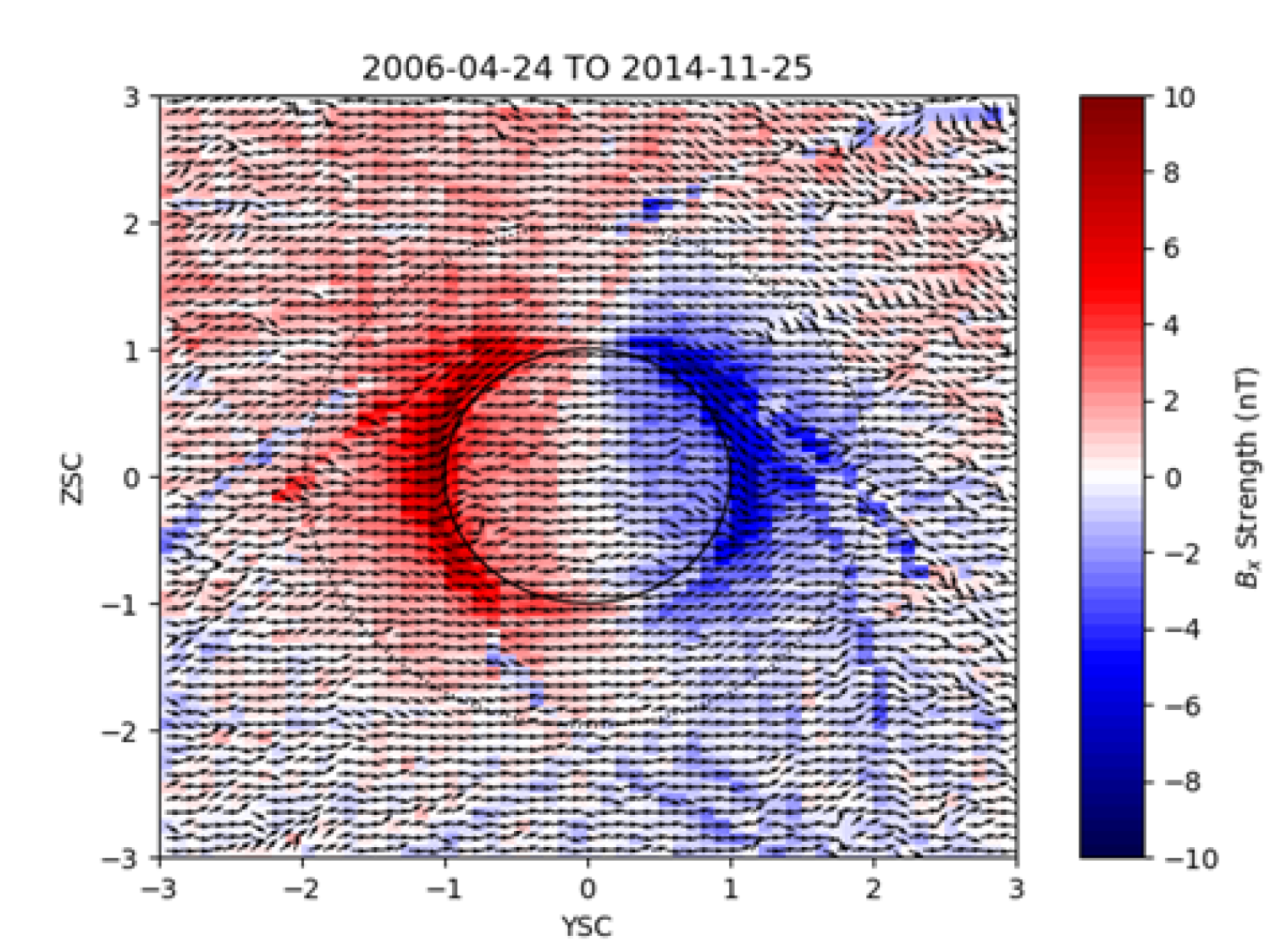 Third place went to Elysia Salvo Lucas with, “Magnetic Field Draping at Venus.” Lucas is an Applied Math senior and works at LASP, currently contributing to two different code libraries and doing Venus magnetosphere research.
“This project had a very steep learning curve, since I had no prior knowledge of any planetary science,” Lucas said in a statement about the project. “Not only was I learning how the magnetosphere is created, but I was also learning advanced plotting and programming techniques in Python. My main goal for this semester was just to visualize all 8 years'-worth of data to see if I could tell that magnetic field draping occurs.”
The top three entries, as chosen by a double-blind judging panel of data visualization and graphic design experts, will be on display as an exhibit in Norlin Library in March 2019. Accompanying each visualization are statements by the authors describing how they made their visualizations and what they learned about their data from the visualization process.
The Data Visualization contest seeks to bring greater awareness to the powerful insights made during the process of visualizing data. Assistant Professor Phil White coordinated the contest. “Creating a visual representation of data is much more than creating pretty pictures—it is a pivotal moment in the research process,” said White. “For students and researchers working with many different types of data, creating a visualization is a time for learning, reflecting and engaging more deeply in their research.”
The University Libraries and Research Computing work together in the Center for Research Data and Digital Scholarship to advance the discovery, creation, and sharing of digital information. If you are interested in learning more about data visualization, CRDDS offers scientific and data visualization consulting every Tuesday from noon to 1 p.m. in Norlin, room E206, as well as a wide range of educational and training opportunities. Visit CRDDS to learn more and join their mailing list to learn when the 2019-2020 Data Visualization contest opens in the fall.

The Winners of the 2018 Data Visualization Contest

1st Place, McKenzie Weller, Computer Science

2nd Place, Julia Uhr, Philosophy

3rd Place, Elysia Salvo Lucas, Applied Mathematics