Be Boulder uses CU Boulder's brand colors for taglines, logos and design layout. Visually, our university should stand as a cohesive unit, as we communicate internally and externally with our community, state and world. Because of the importance of representing a cohesive identity, we ask that you please use only the approved color combinations for all taglines, logos and CU Boulder communication pieces.
Approved Color Combinations
Below are the approved color combinations for CU Boulder’s tagline. Please always use approved artwork for your projects, and please do not attempt to match this letterform with other typefaces, no matter how similar they may appear. This will ensure the consistent use of the tagline in all applications.
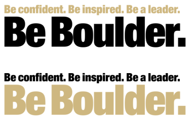
White or Light Background
When the tagline appears on a white or light-colored background, the primary configuration is black or CU Gold.


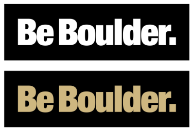
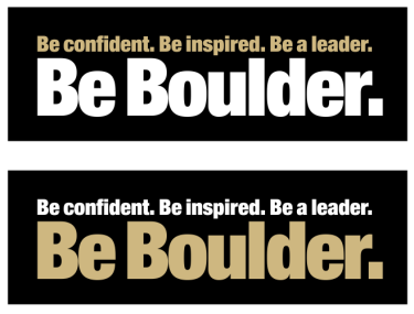
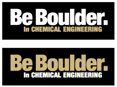
Black or Dark Background
When the tagline appears on a black or dark-colored background, the primary configuration is white or CU Gold.


Over a Photo
When the tagline appears over a photograph and CU Gold does not read well, the primary configuration is white or black.


Color Use in Design and Layout
CU Boulder communication pieces should use brand colors to identify them as coming from our university. The majority (90%) of all colors used on all communications should be brand colors. Additional colors should be complementary, used sparingly and highlight crucial facts or calls to action. Color usage is not limited in photography and colorful photos are encouraged.
Additional color usage is depicted in the chart below.
